Components are powerful tools that allow you to create reusable UI elements or logic that can be used across multiple screens within an app.
Here are some of the advantages of using components when designing an app:
- Reusability:
Once you design a component it can be inserted wherever it’s needed without having to recreate the same design or logic.
- Consistency:
Using components ensures that the look and feel of common UI elements and logic remain consistent throughout the app. For example, if you create a custom button, any changes you make to this button will automatically reflect wherever the component is used.
- Simplified Maintenance:
You can make updates in one place (the component) and have those changes propagate throughout the app. This reduces the risk of errors and makes the app easier to maintain.
- Encapsulation of Logic:
When you create a component, you’re not just designing the visual part, but you’re also packaging the behavior into one neat package. This means all the actions and rules you want it to perform are built into the component itself. So, whenever you use this component, it brings along all its built-in actions without setting them up again. For example, navigating to a screen.
- Custom Properties:
Components can have custom input and output properties, making them flexible and adaptable to different contexts.
The “Scope” option
The “Scope” option determines the visibility and availability of the component across the app. It controls whether the component is available only within a single screen or across the entire app. There are two scopes:
1) Local (Screen) Scope:
When a component is set to Local scope, it is available only on the screen where it is added. This means you can create different instances of the same component on different screens, each with its own unique configuration.
Use this scope if the component is meant to be used uniquely on different screens, and its properties and behavior do not need to be constant across the entire app.
Example: If you have a confirmation dialog component that should have slightly different messages or actions depending on the screen, you might use a local scope so each screen can have its own version of the component.
2) Global (App) Scope:
When a component is set to Global scope, it can be used across all screens within the app. This allows you to insert the component into multiple screens, with the component’s properties and behavior consistent throughout the app.
Use this scope when you need to reuse the component across multiple screens, reducing the need to recreate or configure the component in each screen separately.
Example: A header or navigation bar component that should appear on all screens of the app would be set to global scope so that it can be reused without needing to be recreated for each screen.
Creating a local component
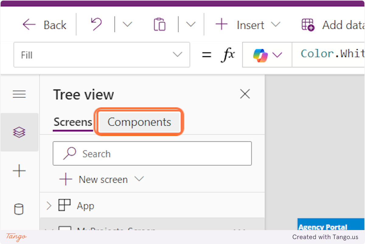
1. To create a new local component, click on Components
2. Click on New component
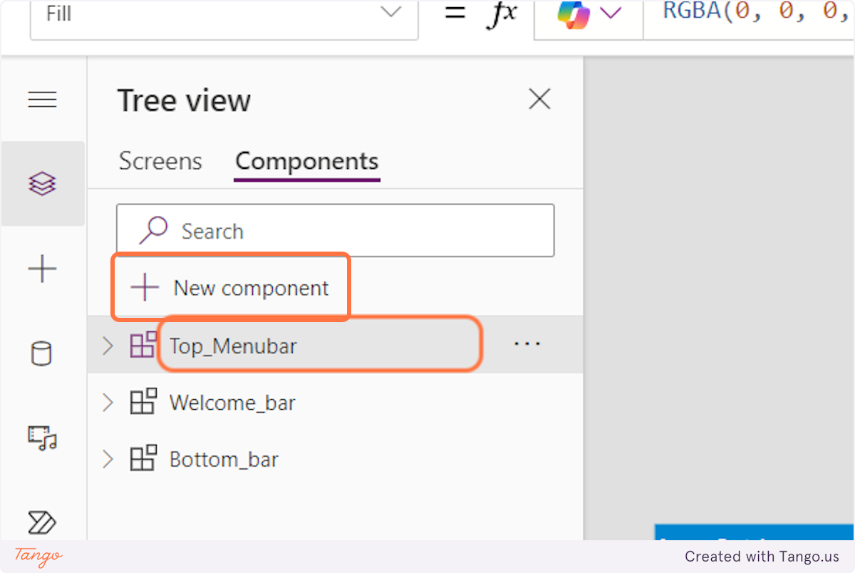
Now, you just design and structure your components as you want. You also have the opportunity to add new custom properties.
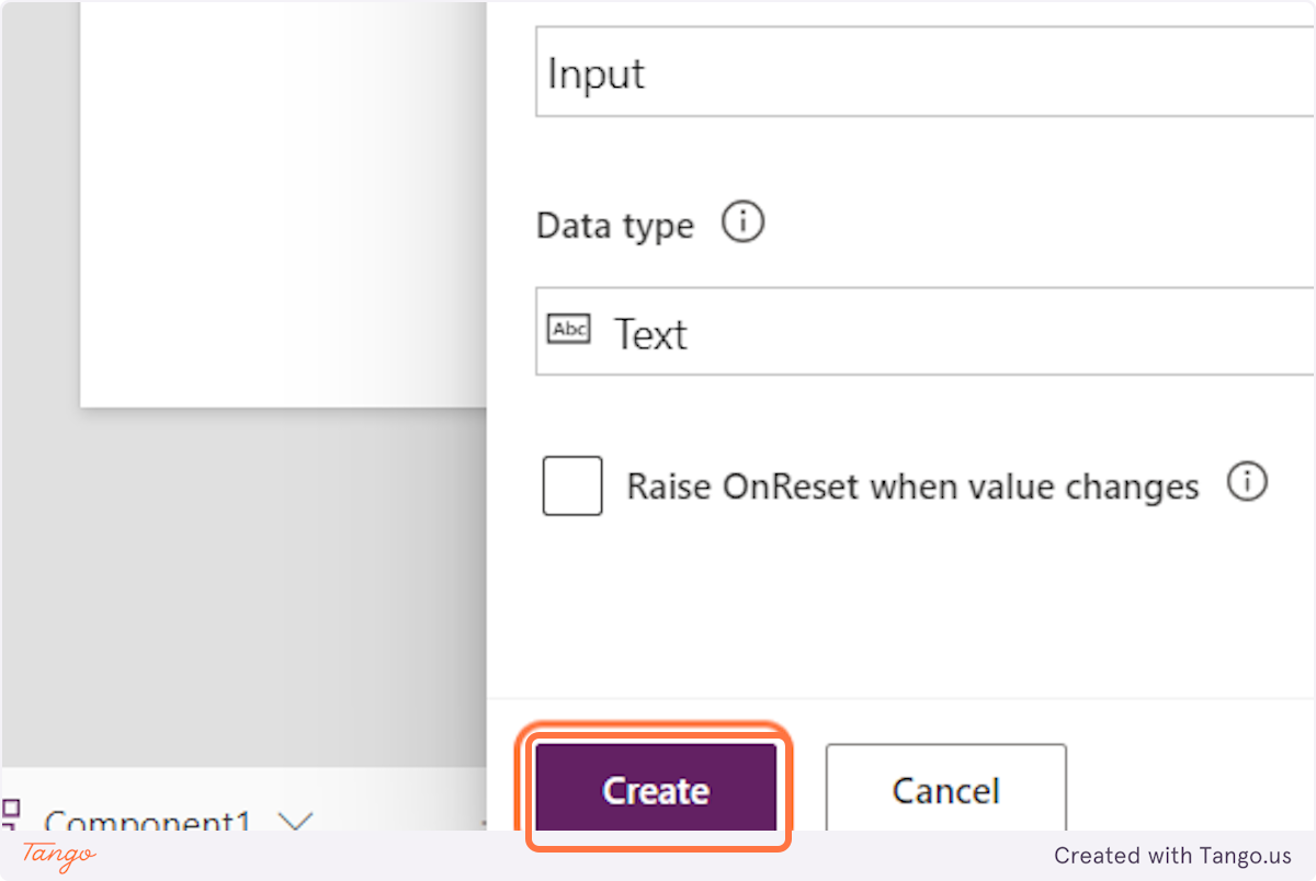
3. Click on New Custom property

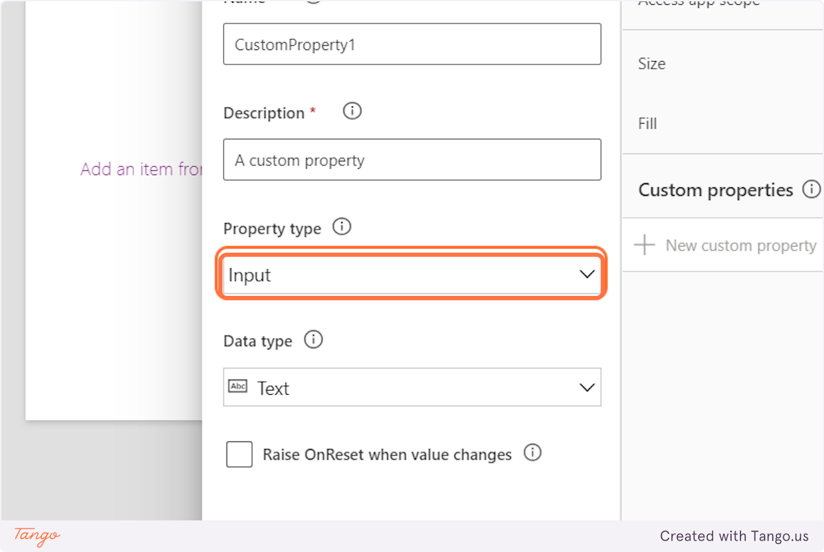
4. Fill in the required fields and choose the property type
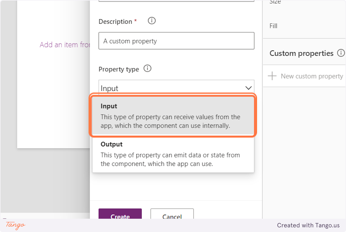
5. Click on Input type if you want external data to be passed into the component or click on Output type to allow the component to send data back out to the app or other components.
6. Click on Create
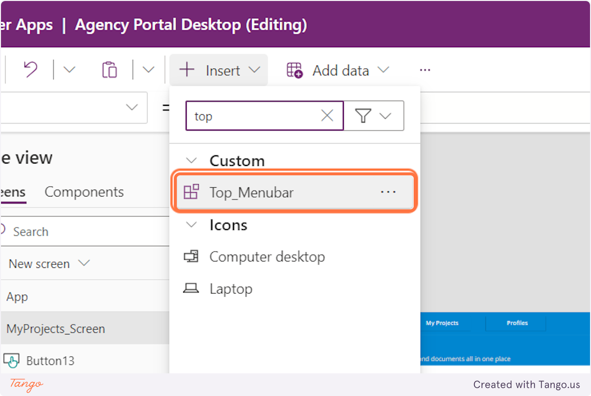
7. Then, to add the component to the screens of your app, click on Screens
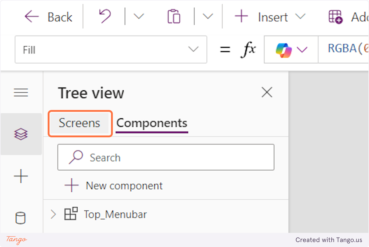
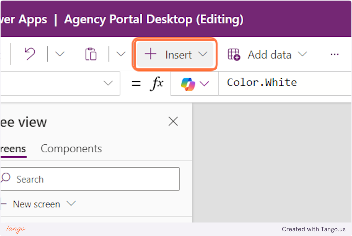
8. Click on Insert
9. Type the name of your component
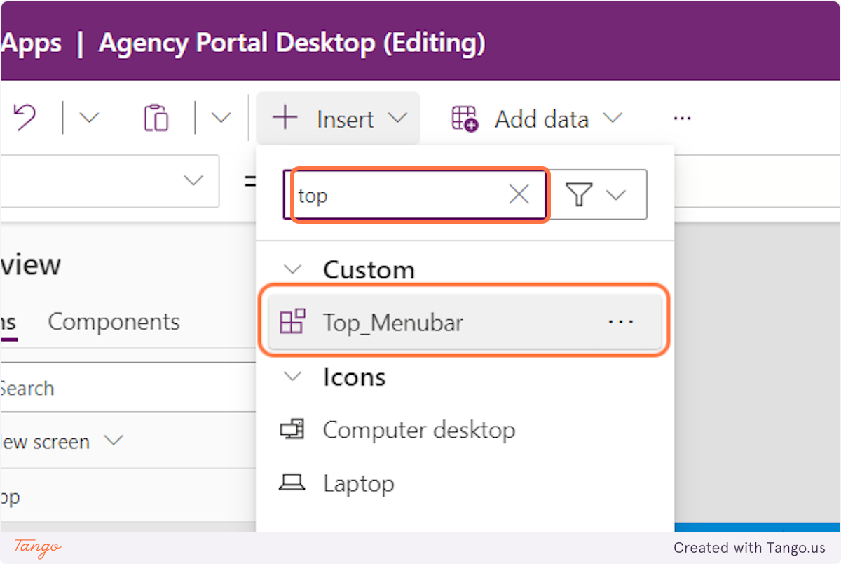
10. Click on that and you have just set the component you created across multiple screens
Creating a global component
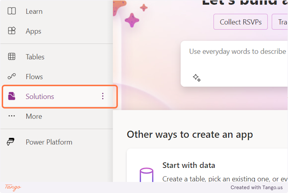
1. Click on Solutions
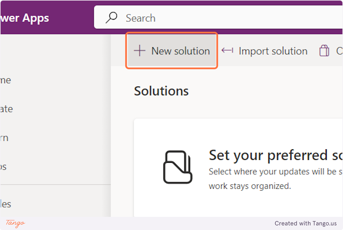
2. Click on New solution
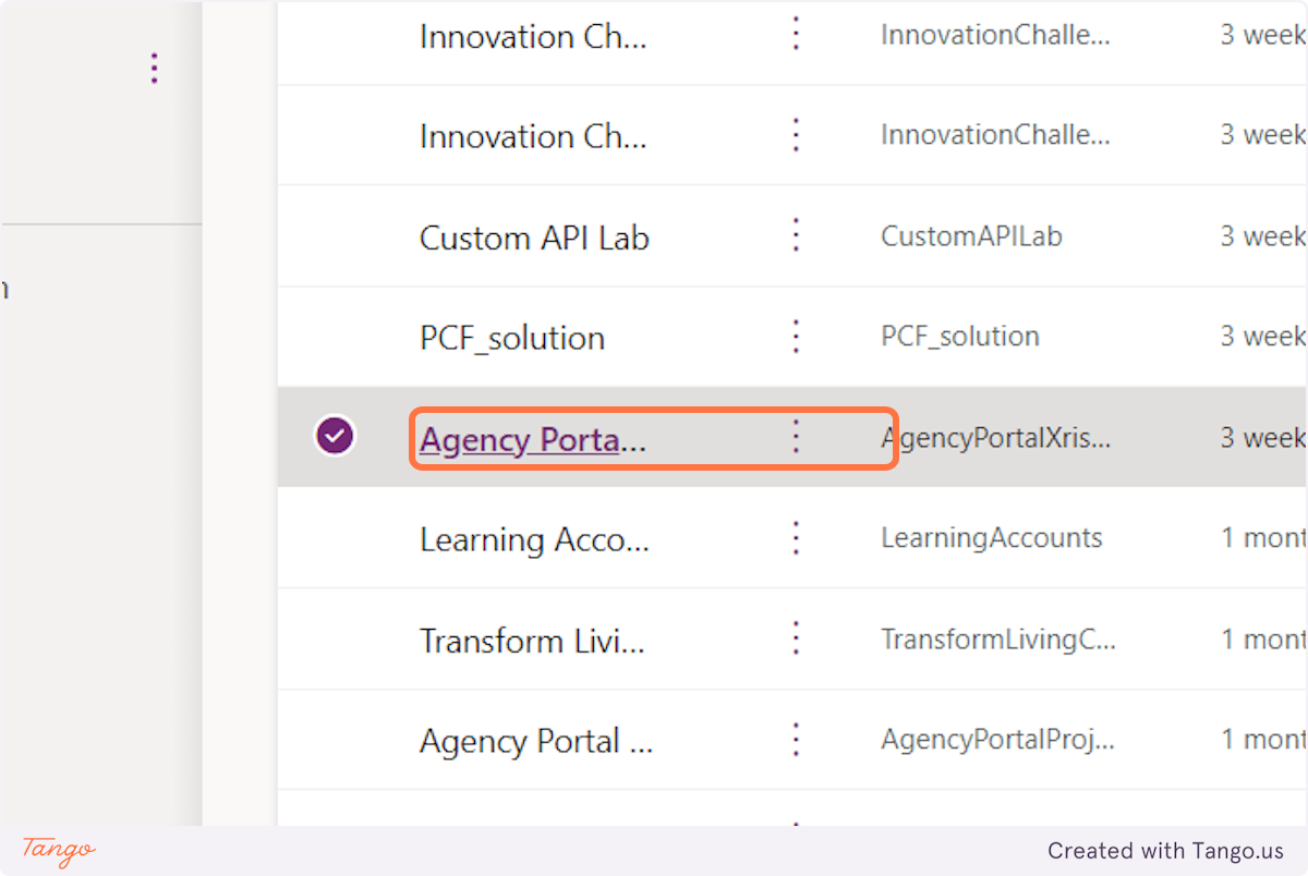
3. Or Click on an already existing solution you want to create a component library in
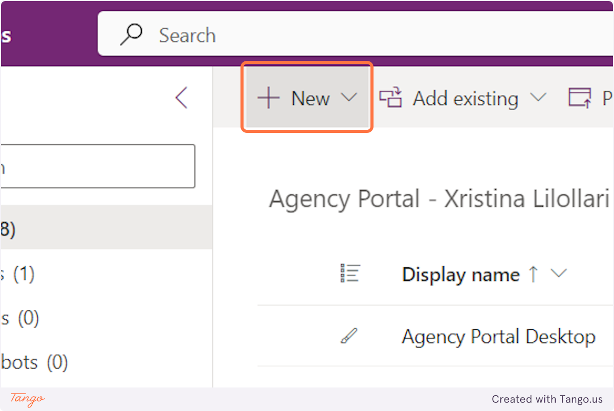
4. Click on New
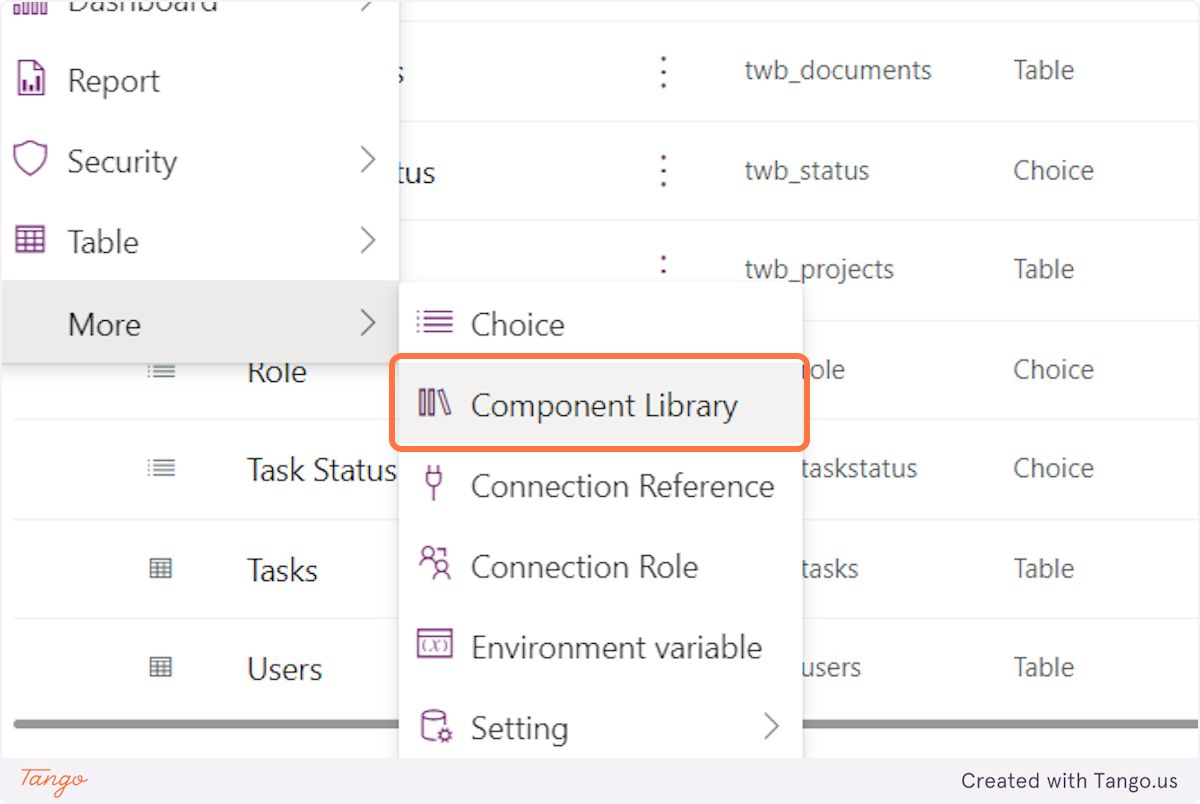
5. Click on Component Library
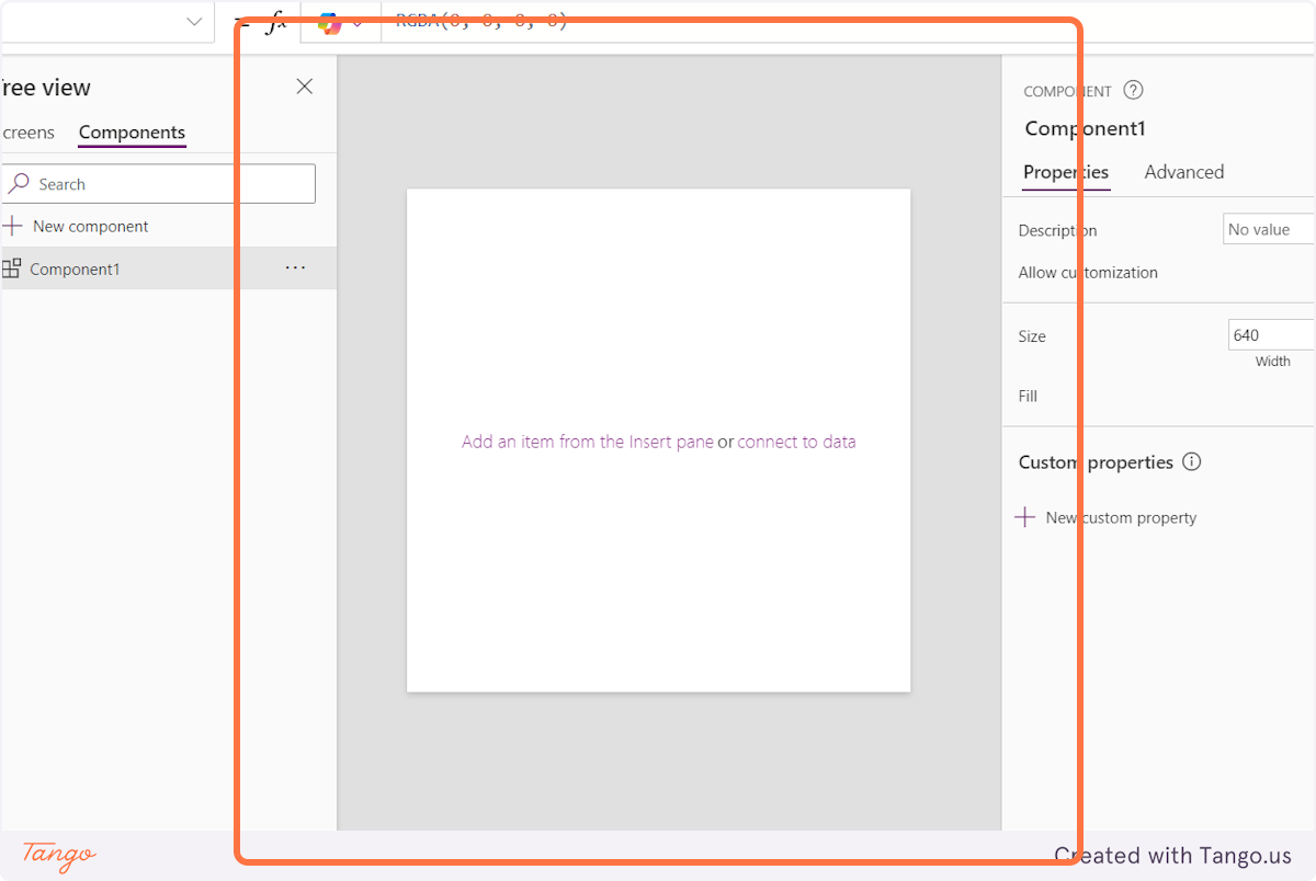
6. Now go on and create your component as you want
Conclusion
Using local components streamlines development within a single app by allowing for reusable and maintainable elements, while global components enable consistency and efficiency across multiple apps by centralizing reusable design elements and logic in a shared library.
Expand your skills! Explore our other tutorials to take your knowledge further:


